An icon commissioned: We have color!
This is the second set of pictures in the commissioned icon series. There are quite a number of icon-related website out there, but few cover the creation process - below comments are from the iconographer. Rather excited to see the color go on.
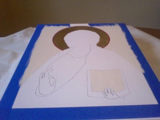
Once the panel has received a final sanding it is buffed with a soft dry rag to remove excess chalk dust. The basic shapes of the pattern are drawn on the board, and the borders are outlined. I like to use painter's tape to delineate the borders and keep them clean.
The background color is painted and the halo (or nimbus) is sized and gilded with 23-kt. gold leaf. In his essay on iconology, Fr. Pavel Florensky emphasizes that gold, being a metal element with a luster of its own (as opposed to a pigment), is the best way to represent the divine light.
The pigments for establishing the main color swaths. Certain mineral pigments require a good bit of grinding with stone or glass pestle before they can be used for making paint.

The initial colors are laid down on the board. The flesh undertone is called sankir (προπλασμός), or, in the Renaissance tradition, verdaccio. This earthy undertone for flesh is a witness to the belief that man was made from the dust of the ground.
Red and blue (the humanity and divinity of Christ respectively) are placed on the appropriate areas using the petit lac (literally "small lake") method, in which highly saturated pools of color are laid in conjoining patches on the panel surface. (Part of the red petit lac is still visible in this photo.) The petit lac method can create a very nice mottled effect that gives a very interesting complexity to the finished icon.

Once the panel has received a final sanding it is buffed with a soft dry rag to remove excess chalk dust. The basic shapes of the pattern are drawn on the board, and the borders are outlined. I like to use painter's tape to delineate the borders and keep them clean.
The background color is painted and the halo (or nimbus) is sized and gilded with 23-kt. gold leaf. In his essay on iconology, Fr. Pavel Florensky emphasizes that gold, being a metal element with a luster of its own (as opposed to a pigment), is the best way to represent the divine light.
The pigments for establishing the main color swaths. Certain mineral pigments require a good bit of grinding with stone or glass pestle before they can be used for making paint.
The initial colors are laid down on the board. The flesh undertone is called sankir (προπλασμός), or, in the Renaissance tradition, verdaccio. This earthy undertone for flesh is a witness to the belief that man was made from the dust of the ground.
Red and blue (the humanity and divinity of Christ respectively) are placed on the appropriate areas using the petit lac (literally "small lake") method, in which highly saturated pools of color are laid in conjoining patches on the panel surface. (Part of the red petit lac is still visible in this photo.) The petit lac method can create a very nice mottled effect that gives a very interesting complexity to the finished icon.


Comments
Post a Comment